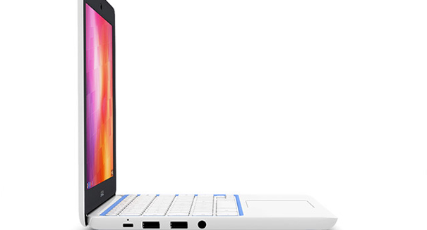
Google has changed the launcher to emphasize search and the user's favorite apps -- which may rub some the wrong way.
Big changes are coming to a Chromebook near you — and one of the biggest is an app launcher with Google Now already built into it.
Now, instead of getting a small pop-up that shows all of the apps available, you get a larger window right in the center of the screen with the Google logo on top, the search box, and your four most recent apps along with a button that allows you to view “all apps,” according to a PC World report.
The launcher is now available on the Chrome OS beta channel, and it includes some other features as well, such as the ability to open password-protected ZIP files and an option to automatically change the time zone based on the location of the computer. Meanwhile, its Files app is getting a brand new look.
The only problem is it adds another step to accessing Chrome apps, but for those who already pin their favorite apps to the taskbar of the Chrome OS, this probably isn’t a big deal.
The brand new look and design indicates that Google is focusing more on search and contextual information rather than showing you everything in order to improve how space on the computer is used, according to the report.
In order to change the channel, you can go to Settings, and then click About Chrome OS. Then, click More Info and Change the Channel. After that, you will need to restart and then click on “check for and apply updates.”
Chrome Launcher 2.0 basically looks more like a new tab on your Chrome browser than the traditional one that users have come to expect. It is also integrated with Google Now so you can see appointments, reminders, and other things you choose.